Components
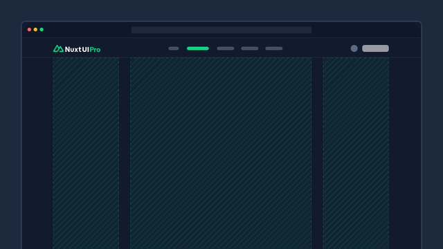
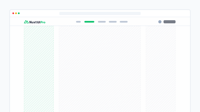
Layout
Core structural components for organizing your application's layout and establishing a consistent foundation for your UI.

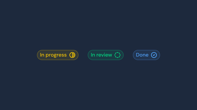
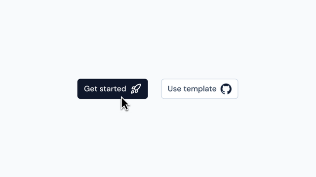
Element
Essential UI building blocks including buttons, badges, avatars, icons, and other foundational interface elements for crafting intuitive and consistent user experiences.

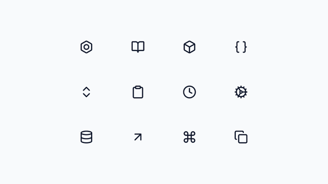
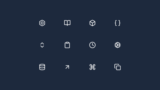


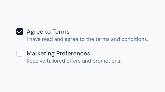
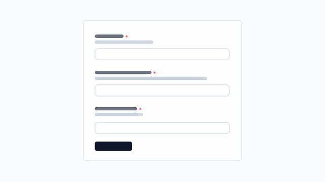
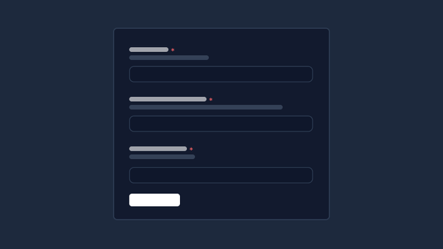
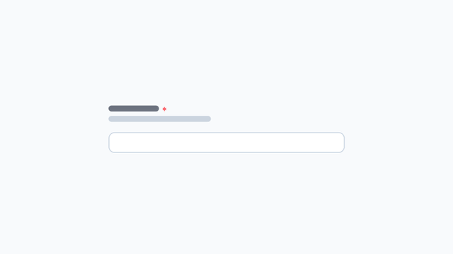
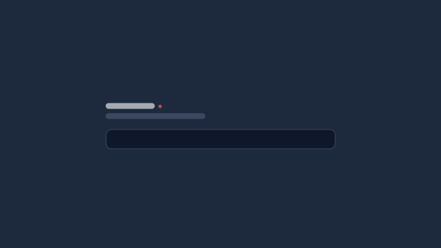
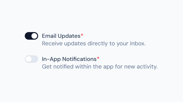
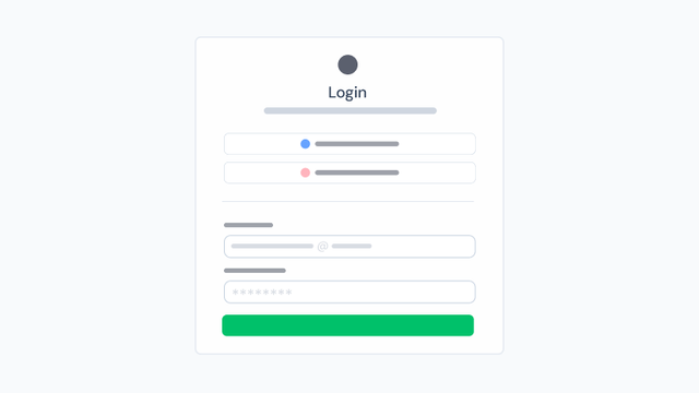
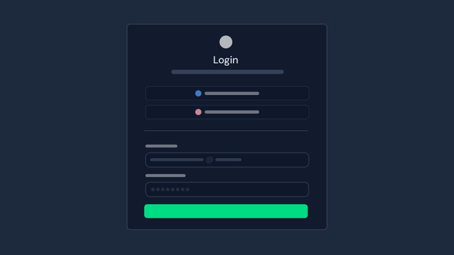
Form
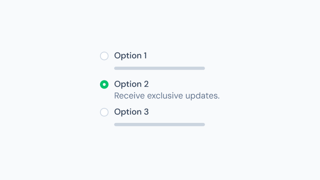
Comprehensive form components for building interactive user input experiences, including text inputs, selects, checkboxes, radio groups, switches, sliders, and complete form validation.


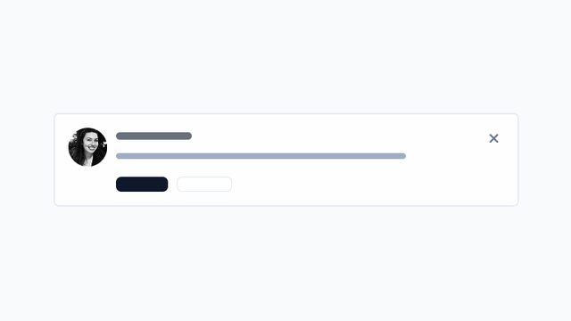
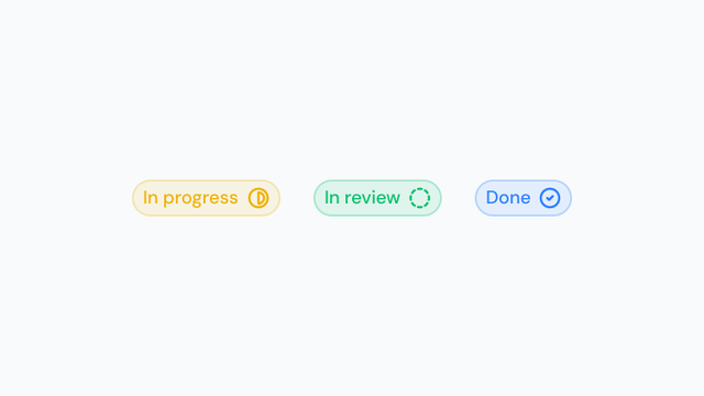
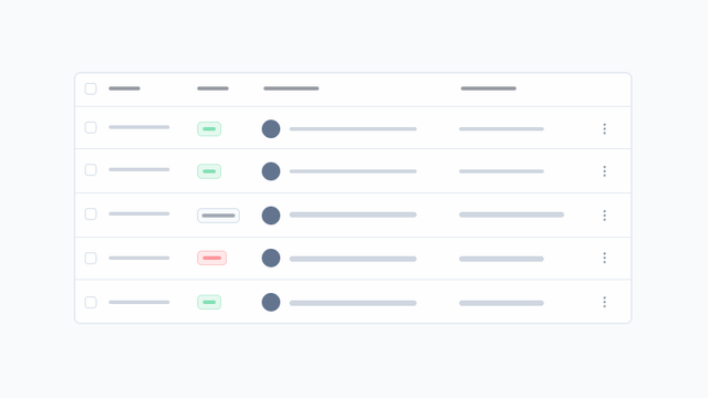
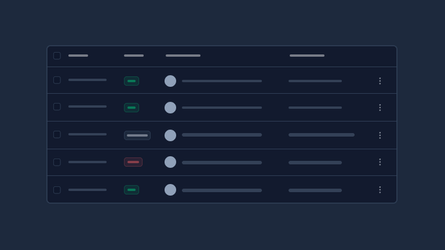
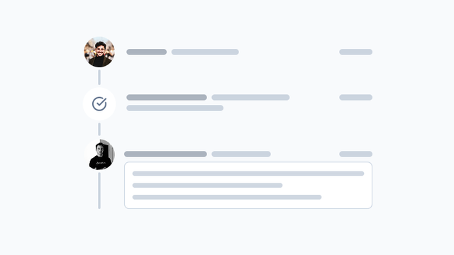
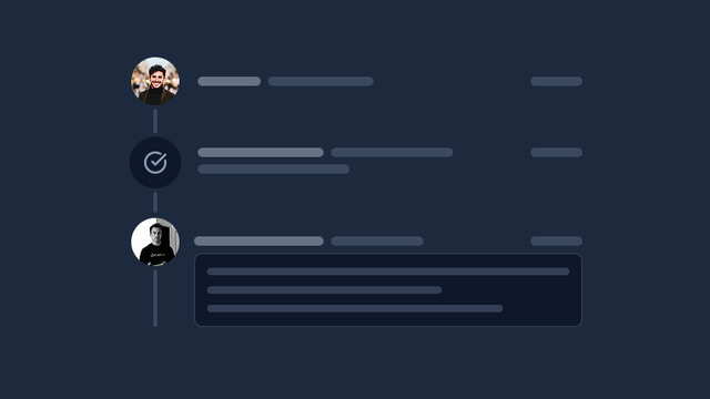
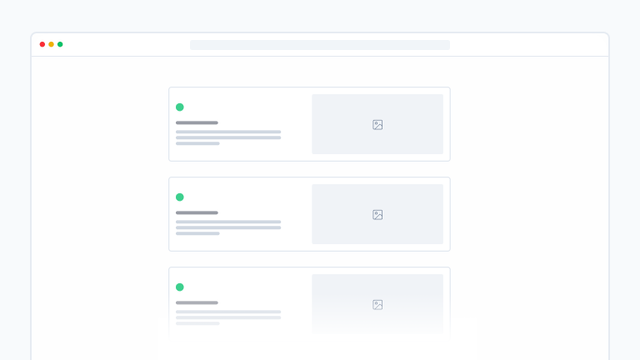
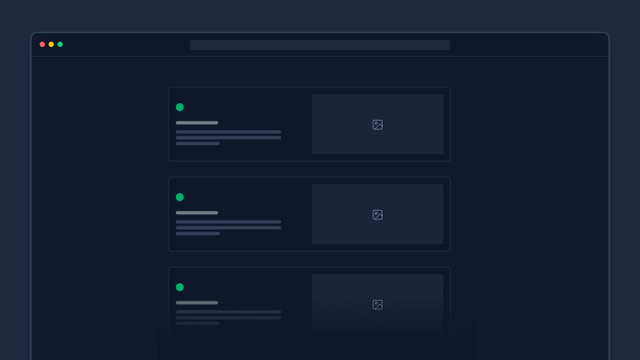
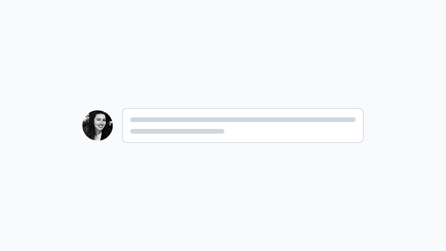
Data
Components for displaying and organizing data, including tables, accordions, carousels, timelines, trees, and user profiles.

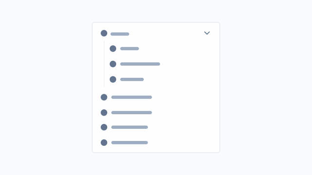
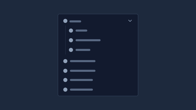


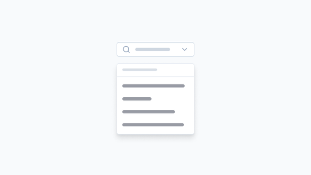
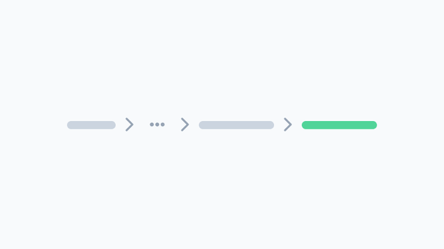
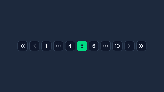
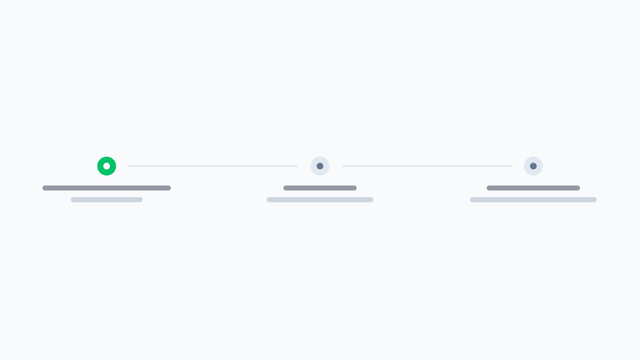
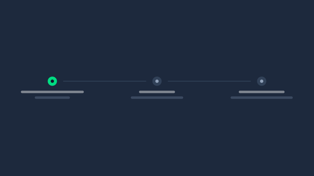
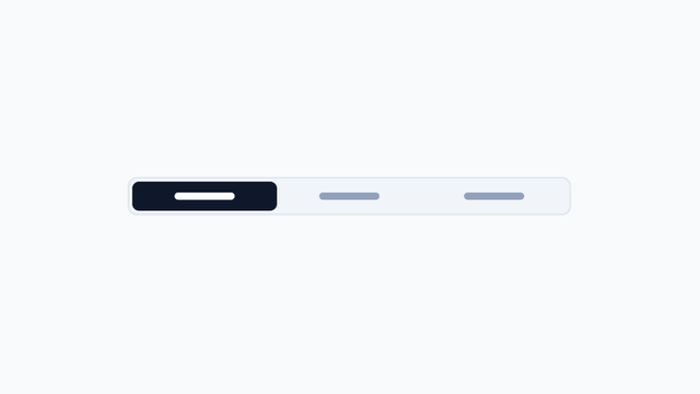
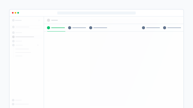
Navigation
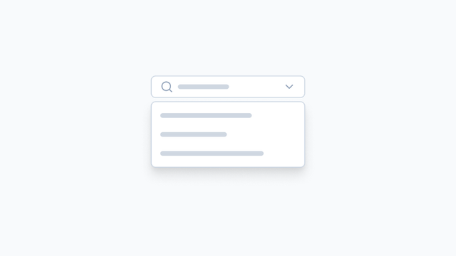
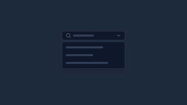
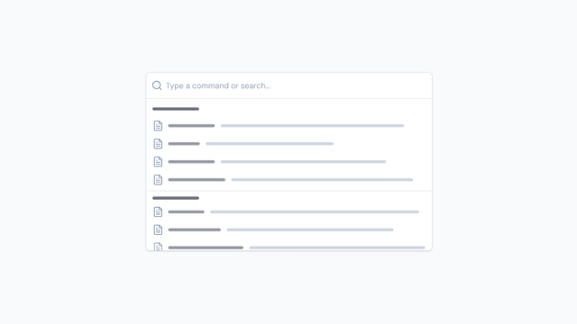
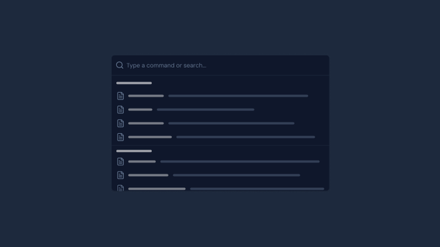
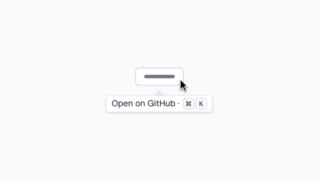
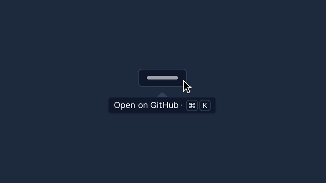
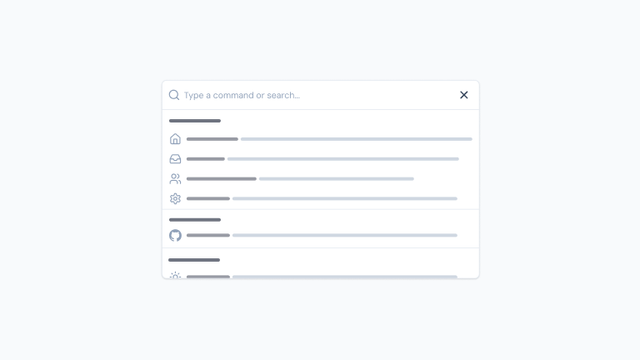
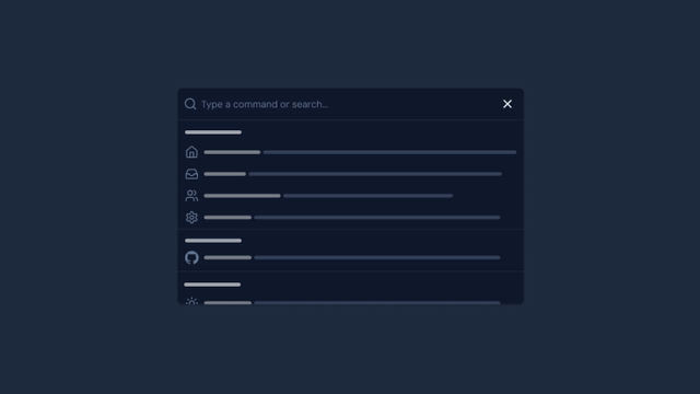
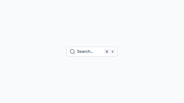
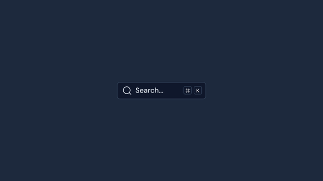
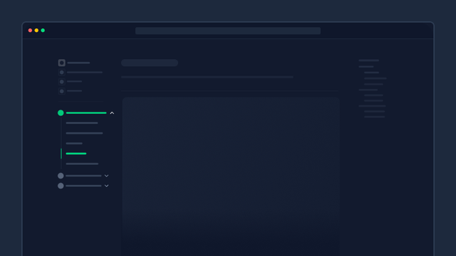
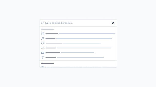
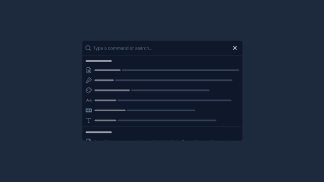
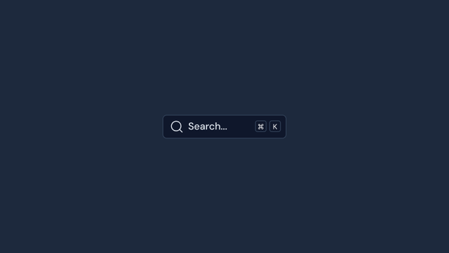
Components for user navigation and wayfinding, including menus, breadcrumbs, pagination, tabs, steppers, links, and command palettes.


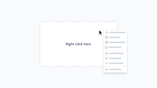
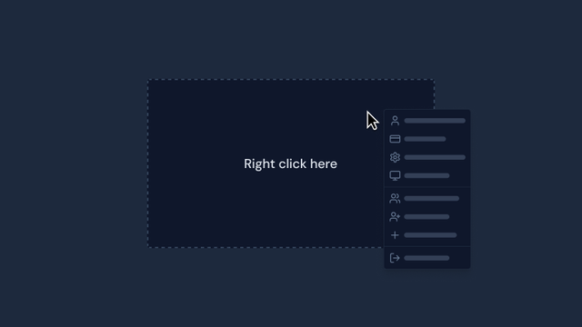
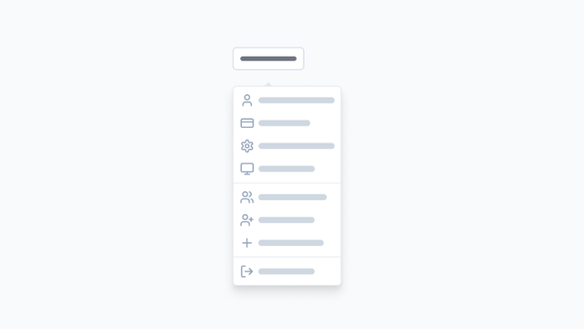
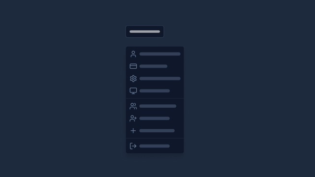
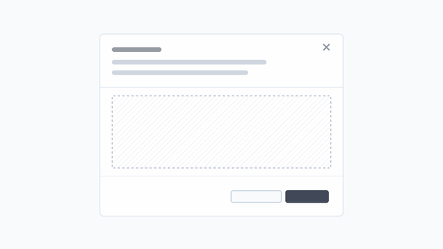
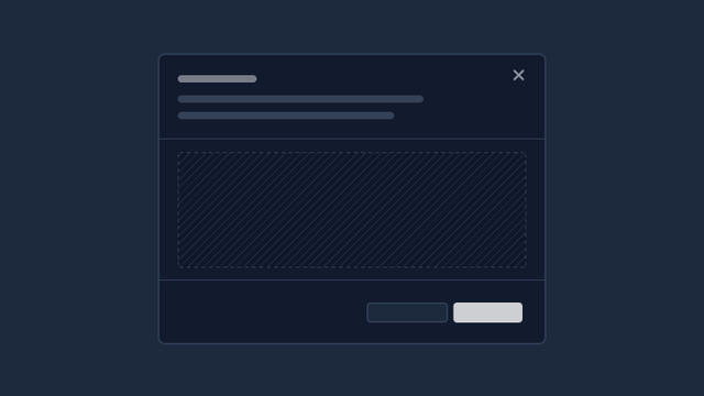
Overlay
Floating UI elements that appear above the main content, including modals, popovers, tooltips, drawers, slideovers, and context menus.
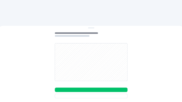
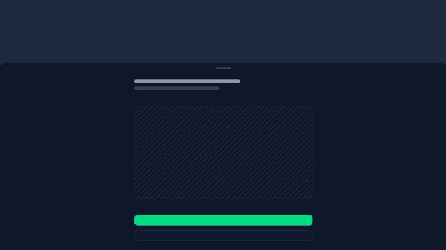


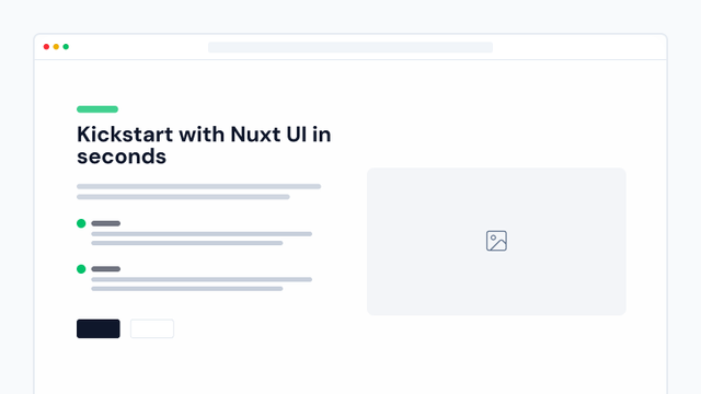
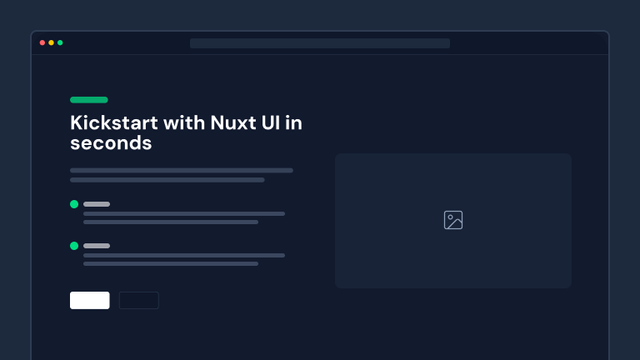
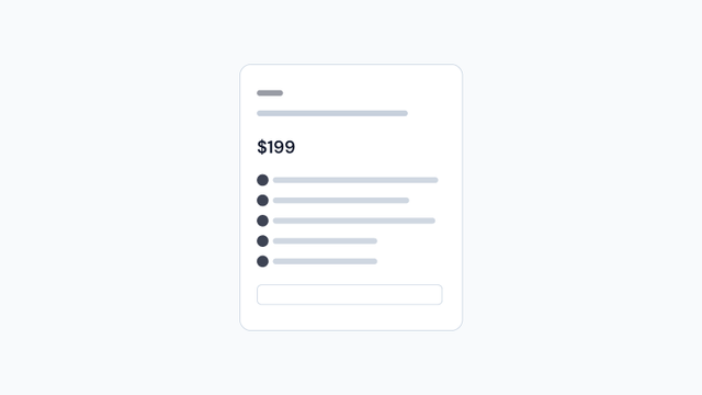
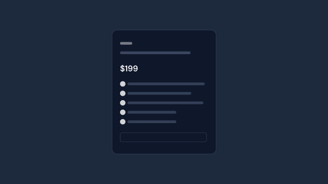
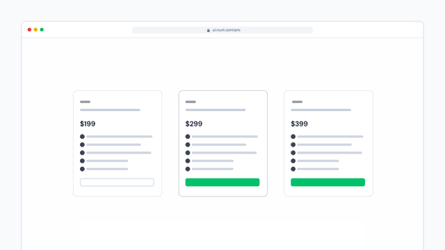
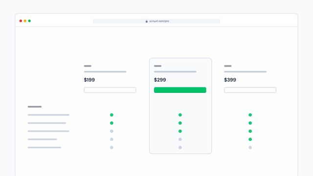
Page
Pre-built marketing and content sections for creating landing pages, blogs, pricing pages, and other marketing materials.

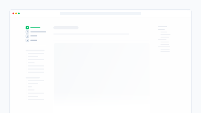
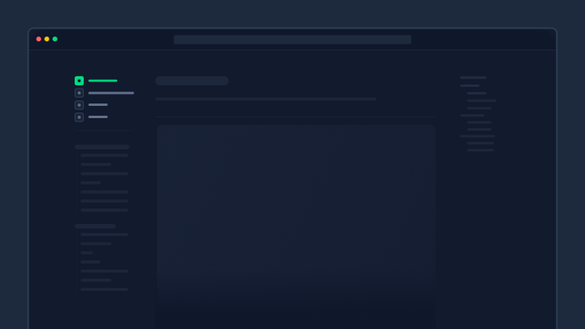


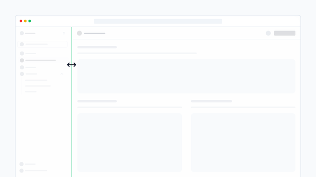
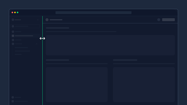
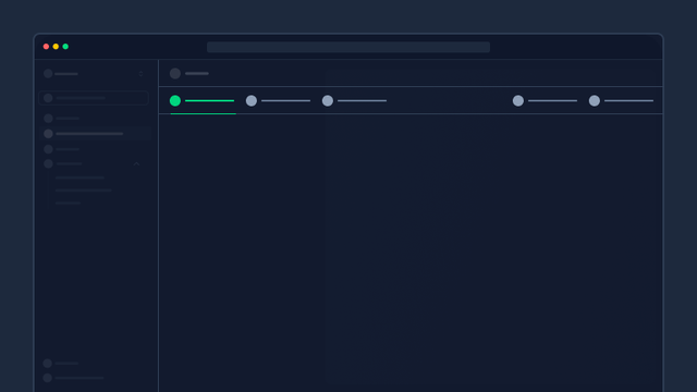
Dashboard
Specialized components for building dynamic dashboards with resizable panels, collapsible sidebars, toolbars, and search functionality.


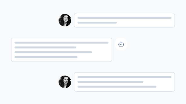
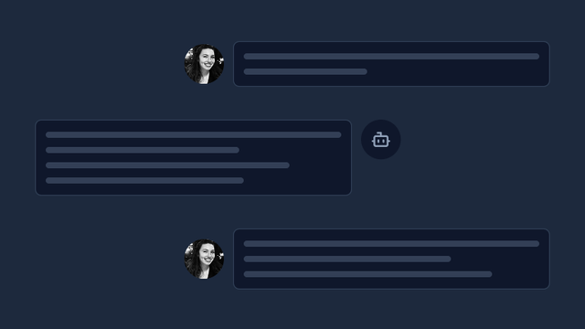
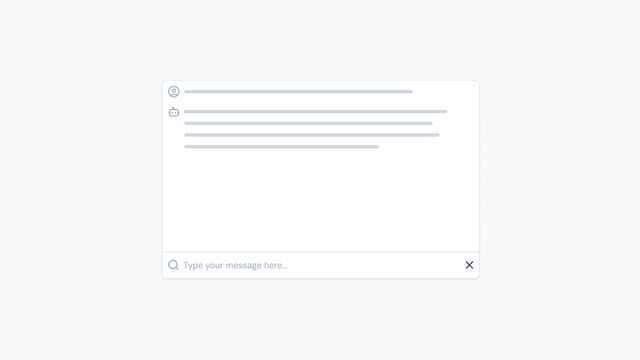
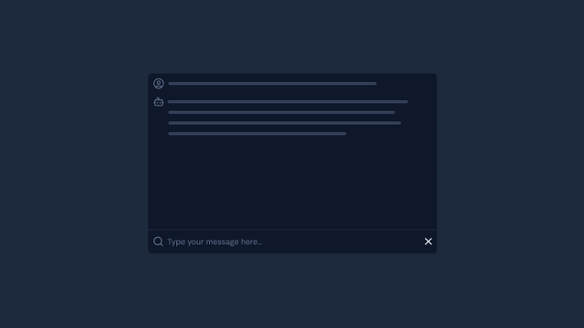
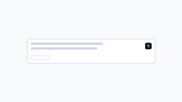
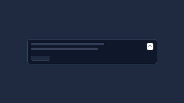
Chat
Components for building conversational interfaces and chatbots, powered by the Vercel AI SDK.

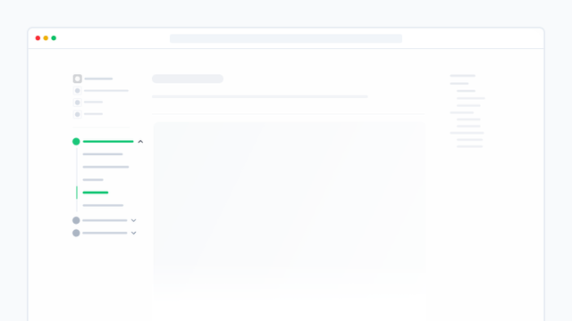
Content
Components that integrate with Content for documentation sites, including table of contents, search, navigation trees, and surrounding page links.

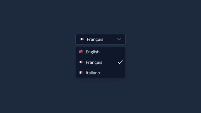
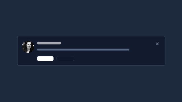
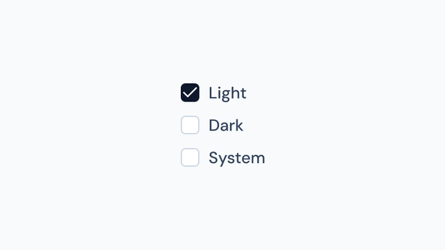
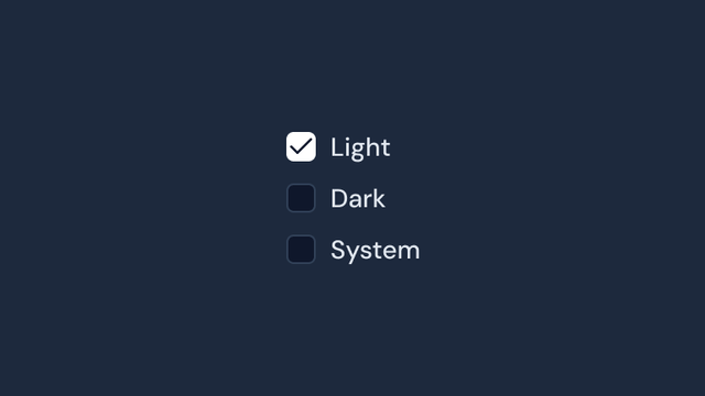
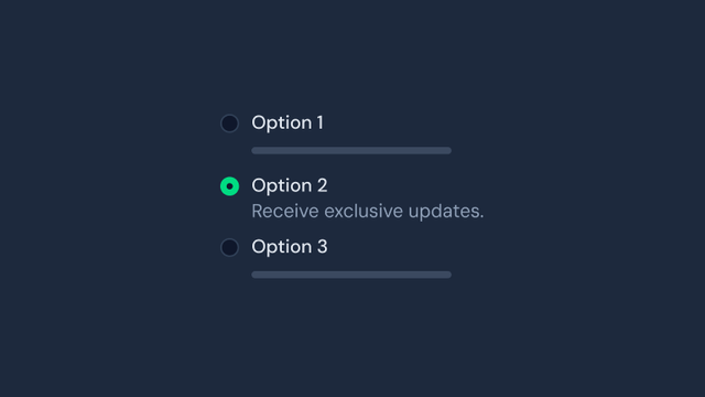
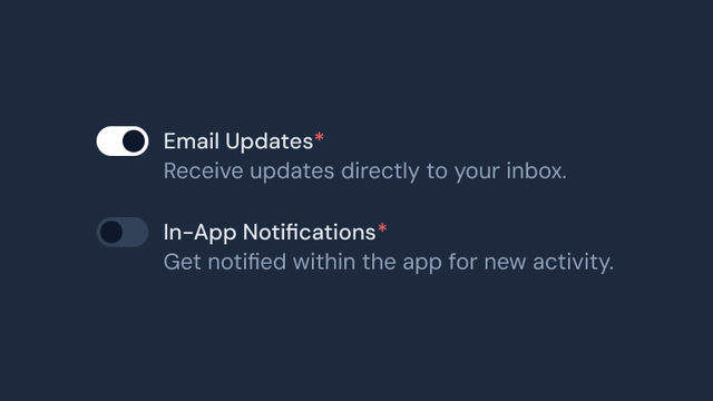
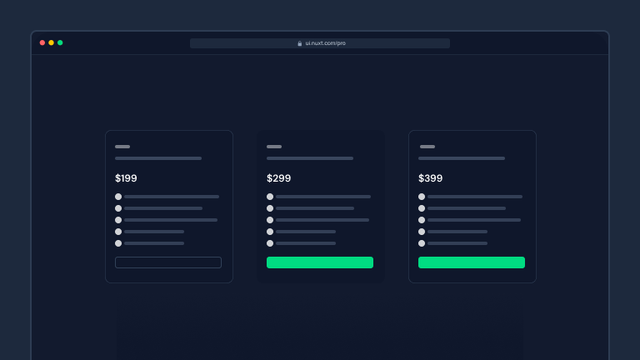
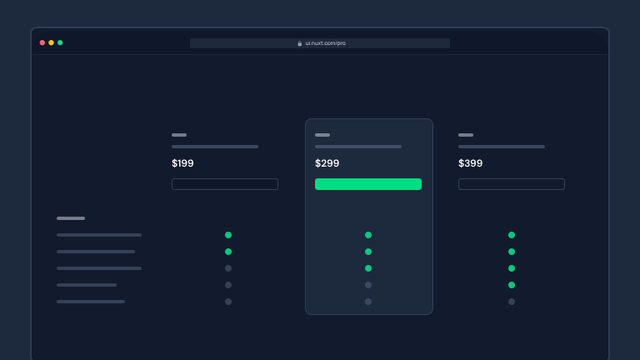
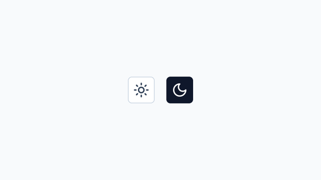
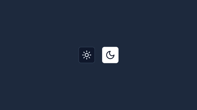
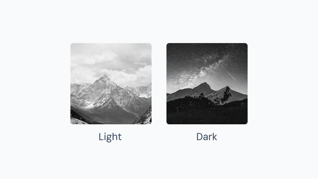
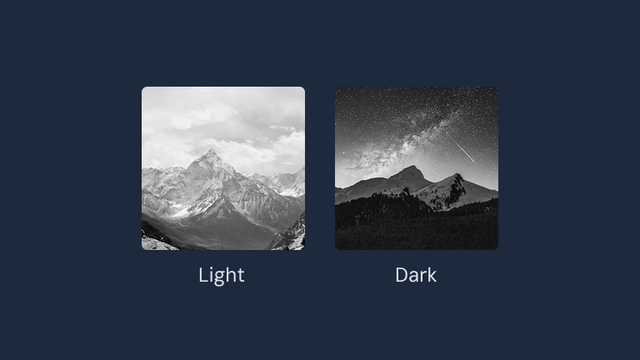
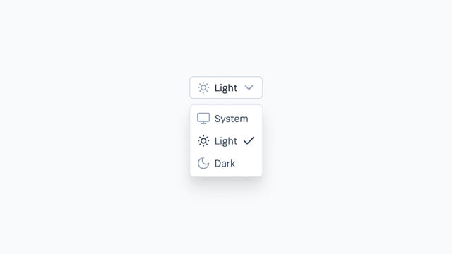
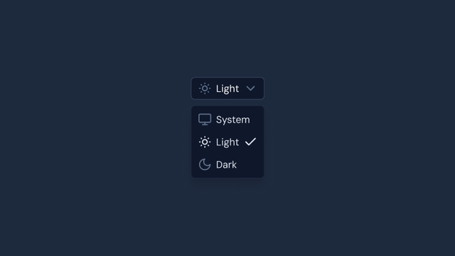
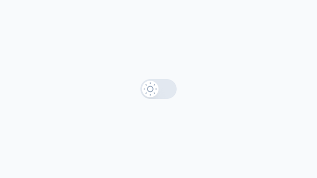
Color Mode
Components that integrate with Color Mode for theme switching between light, dark, and system preferences.

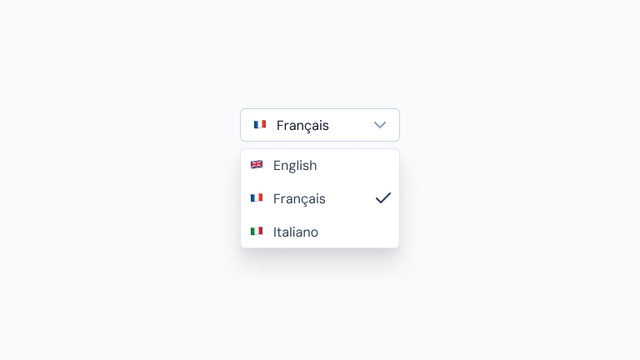
i18n
Components that integrate with i18n for internationalization and locale management.