The Intuitive
Vue UI Library
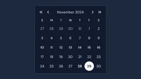
Create beautiful, responsive & accessible web apps quickly with Vue or Nuxt. Nuxt UI is an open-source UI library of 100+ customizable components built with Tailwind CSS and Reka UI.
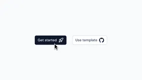
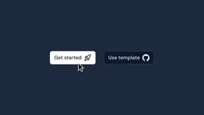
Get startedGet startedExplore components
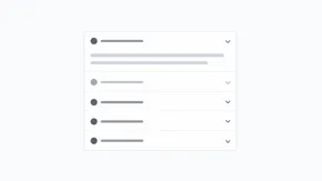
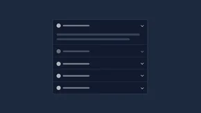
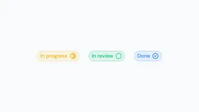
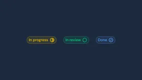
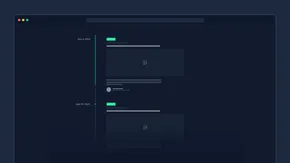
Styled with Tailwind CSS
Beautifully styled by default, overwrite any style you want.
Accessible with Reka UI
Robust accessibility out of the box.
Type-safe with TypeScript
Auto-complete and type safety for all components.


- Go to Build for the modern web
Build for the modern web
Powered by Tailwind CSS and Reka UI for top performance and accessibility.
- Go to Large icons sets
Large icons sets
Access to over 200,000 customizable icons from Iconify powered by @nuxt/icon.
- Go to Easy font customization
Easy font customization
Performance-optimized fonts with first-class @nuxt/fonts integration.
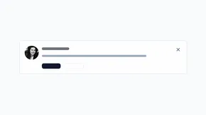
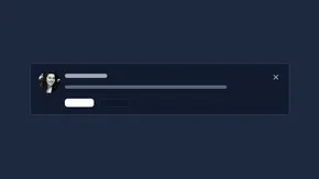
- Go to Light & dark mode
Light & dark mode
Dark mode-ready components with @nuxtjs/color-mode module integration.
- Go to Internationalization (i18n)
Internationalization (i18n)
Translated into 50+ languages, works well with i18n and multi-directional support (LTR/RTL).
- Go to Beautiful typography
Beautiful typography
Integrates with @nuxt/content to deliver beautiful typography and consistent component styling.
Flexible design system
Build faster with Nuxt UI's CSS-first design system powered by Tailwind CSS and its semantic color system combined with a runtime configuration.
- CSS-first configurationDefine fonts, colors, and breakpoints with the @theme directive directly in your CSS. This makes your theme portable, maintainable and easy to customize.
- Semantic color systemConfigure 7 semantic color aliases (primary, secondary, success, info, warning, error, neutral) that describe the purpose of colors rather than specific values.
- Runtime color configurationChange colors, icons and more at runtime through AppConfig without rebuilding your application, perfect for multi-tenant applications or dynamic theming.
@import "tailwindcss";
@import "@nuxt/ui";

@theme {
  --font-sans: 'Public Sans', system-ui, sans-serif;

  --color-brand-50: #f0f9ff;
  --color-brand-100: #e0f2fe;
  --color-brand-200: #bae6fd;
  --color-brand-300: #7dd3fc;
  --color-brand-400: #38bdf8;
  --color-brand-500: #3b82f6;
  --color-brand-600: #2563eb;
  --color-brand-700: #1d4ed8;
  --color-brand-800: #1e40af;
  --color-brand-900: #1e3a8a;
  --color-brand-950: #172554;
}
export default defineAppConfig({
  ui: {
    colors: {
      primary: 'brand',
      secondary: 'purple',
      success: 'green',
      info: 'blue',
      warning: 'yellow',
      error: 'red',
      neutral: 'zinc'
    },
    icons: {
      loading: 'i-lucide-loader-circle',
      search: 'i-lucide-search',
      menu: 'i-lucide-menu'
    }
  }
})
Consistent design tokens
Use CSS variables as design tokens for consistent theming with semantic utility classes that automatically adapt to light and dark modes.
- Semantic color utilitiesUse utility classes like text-primary, bg-success, or border-error that automatically adapt to light and dark modes via CSS variables.
- Text and background tokensComplete set of utility classes for text (text-dimmed, text-muted, text-highlighted), backgrounds (bg-default, bg-elevated, bg-accented) and borders.
- Global layout variablesCustomize global styles with --ui-radius for border rounding, --ui-container for layout widths, and --ui-header-height for consistent spacing.
@import "tailwindcss";
@import "@nuxt/ui";

:root {
  --ui-primary: black;
  --ui-radius: 0.5rem;
  --ui-container: var(--container-5xl);
  --ui-header-height: --spacing(24);
}

.dark {
  --ui-primary: white;
  --ui-bg: var(--ui-color-neutral-950);
}
<template>
  <div class="bg-default border border-default rounded-lg p-4">
    <span class="text-primary">Primary text</span>

    <span class="text-dimmed">Dimmed text</span>

    <div class="bg-elevated p-3 rounded-md mt-2">
      <span class="text-muted">Elevated background</span>
    </div>
  </div>
</template>
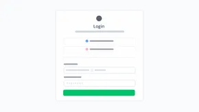
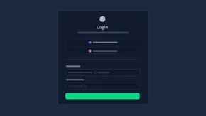
Tailor components to your needs
Use the Tailwind Variants API with slots, variants, and compound variants for powerful component theming with intelligent class merging.
- Tailwind Variants APIComponents use slots for flexible styling, variants for prop-based styles, and compound variants for complex conditional styling with intelligent class merging.
- Global theme configurationOverride component themes globally in app.config.ts using slots, variants, compound variants, and default variants for consistent styling across your application.
- Per-component customizationFine-tune individual components with the ui prop for slot-specific styling and class prop for root element overrides, providing maximum flexibility.
export default defineAppConfig({
  ui: {
    button: {
      slots: {
        base: 'font-bold'
      },
      variants: {
        size: {
          md: {
            base: 'px-4 py-2 text-sm'
          }
        }
      },
      defaultVariants: {
        color: 'neutral'
      }
    }
  }
})
<template>
  <UButton
    label="Button"
    size="md"
    variant="outline"
    trailing-icon="i-lucide-chevron-right"
    :ui="{
      trailingIcon: 'rotate-90'
    }"
    class="rounded-full"
  />
</template>
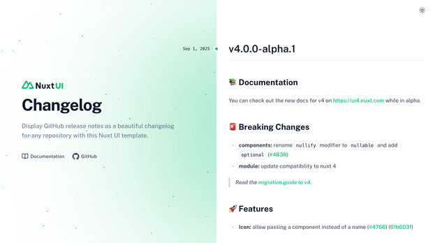
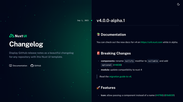
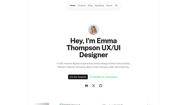
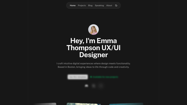
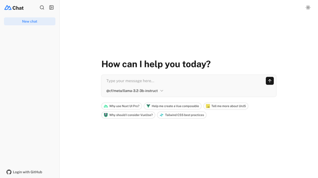
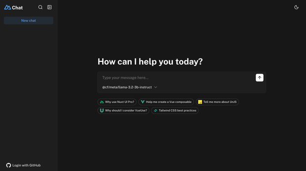
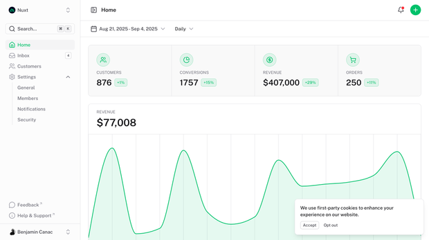
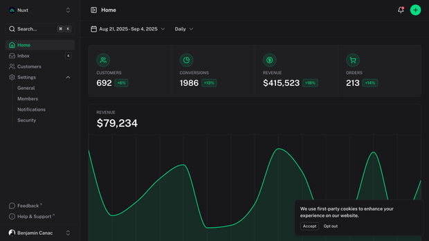
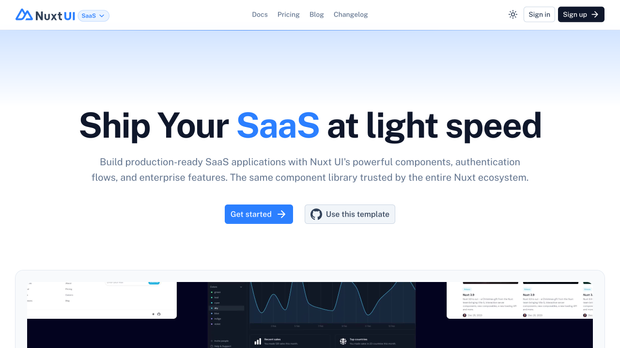
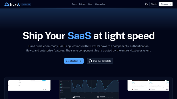
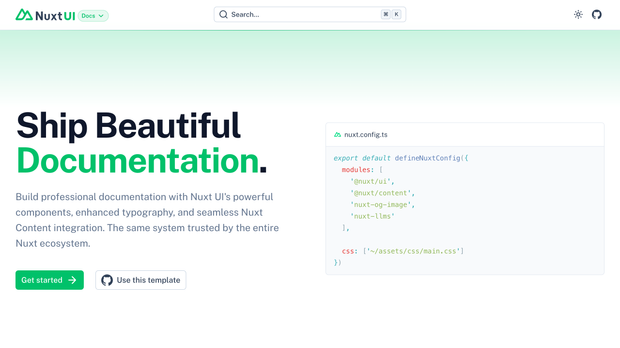
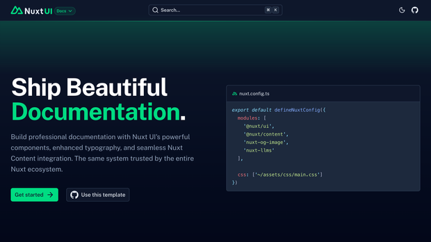
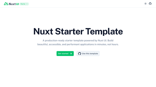
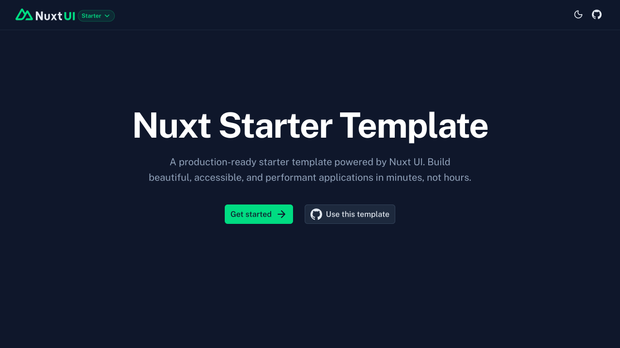
Ship faster with production-ready templates
Start with our fully responsive, accessible, and easy to customize templates, so you can launch your project quickly and effortlessly.
- Production-ready templatesAll templates are built with best practices, SEO optimized, performance tuned, and ready to deploy to production immediately with minimal configuration.
- Nuxt & Vue supportTemplates available for both Nuxt and Vue applications with framework-specific optimizations, choose the one that best fits your project needs.
- Fully customizableBuilt on top of Nuxt UI components with complete source code access, easily customize colors, fonts, layouts, and components to match your brand identity.


Join the Nuxt UI community
Join our thriving open-source community to contribute code, report issues, suggest features, or help with documentation. Every contribution makes Nuxt UI better for everyone in the ecosystem.